

Duolingo
Brand Strategy: James Wu for Johnson Banks
Copywriting: Nick Asbury and Mary Van Ogtrop
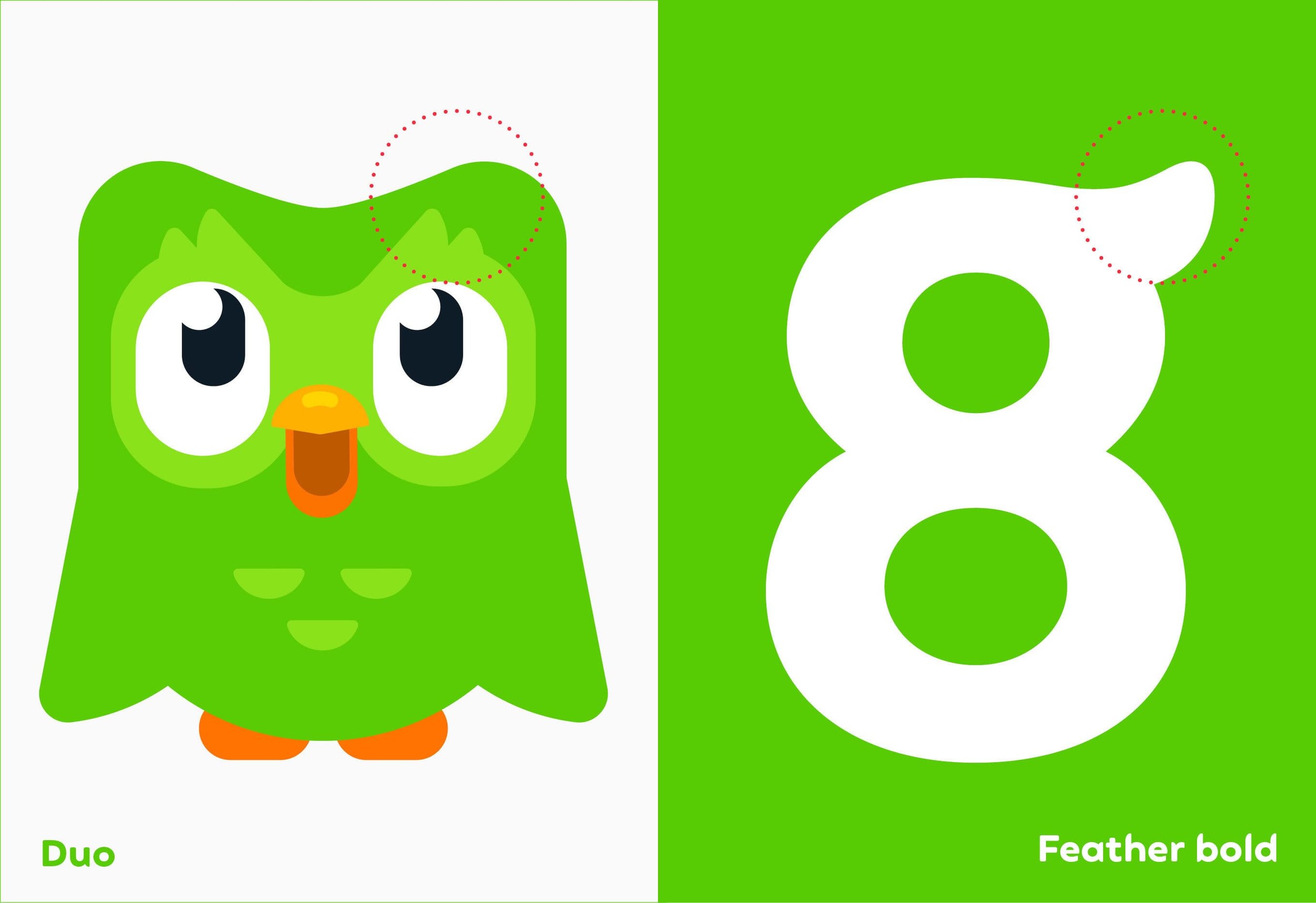
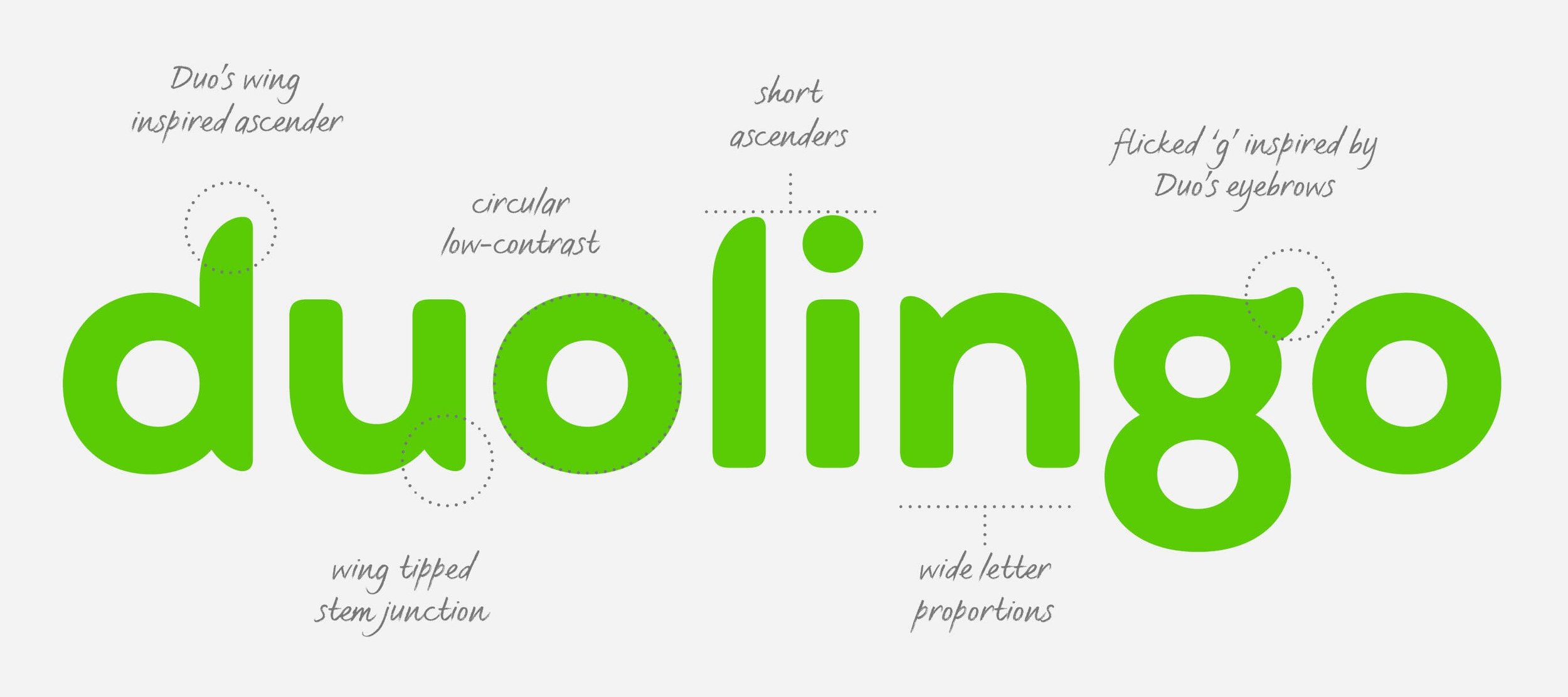
Visual Identity: Johnson Banks
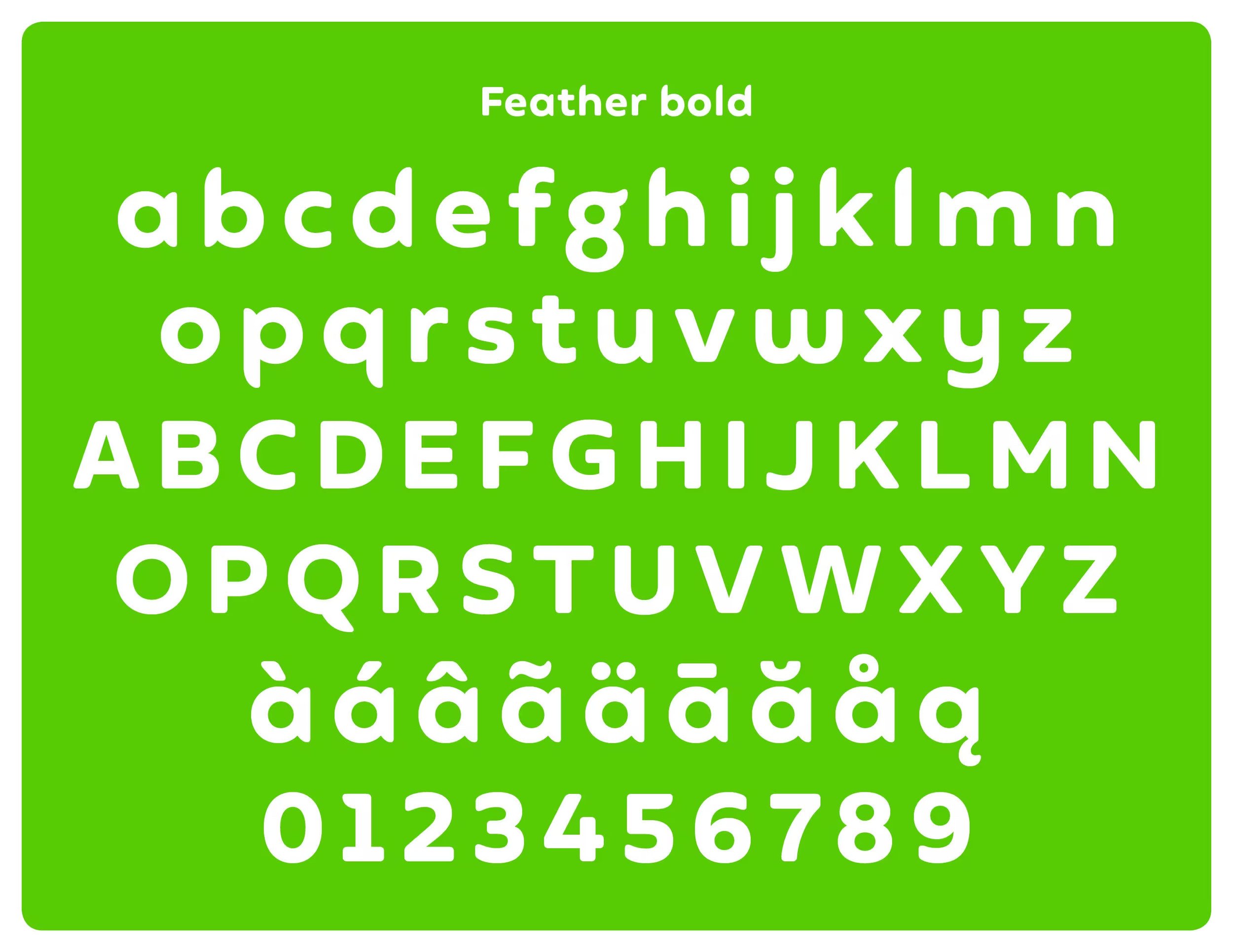
Font Design: Fontsmith
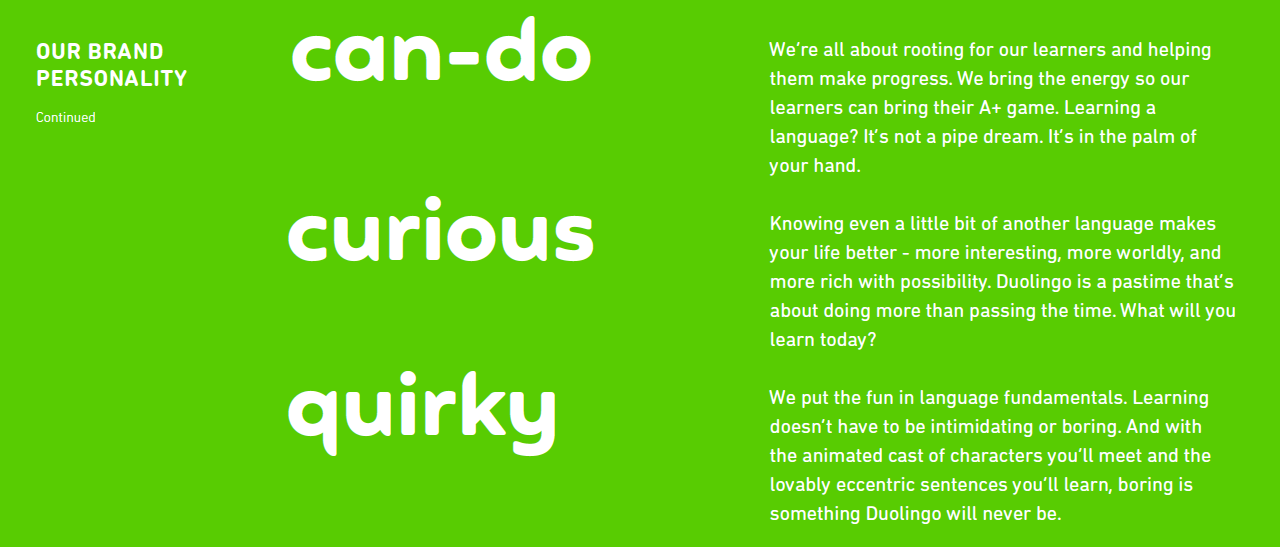
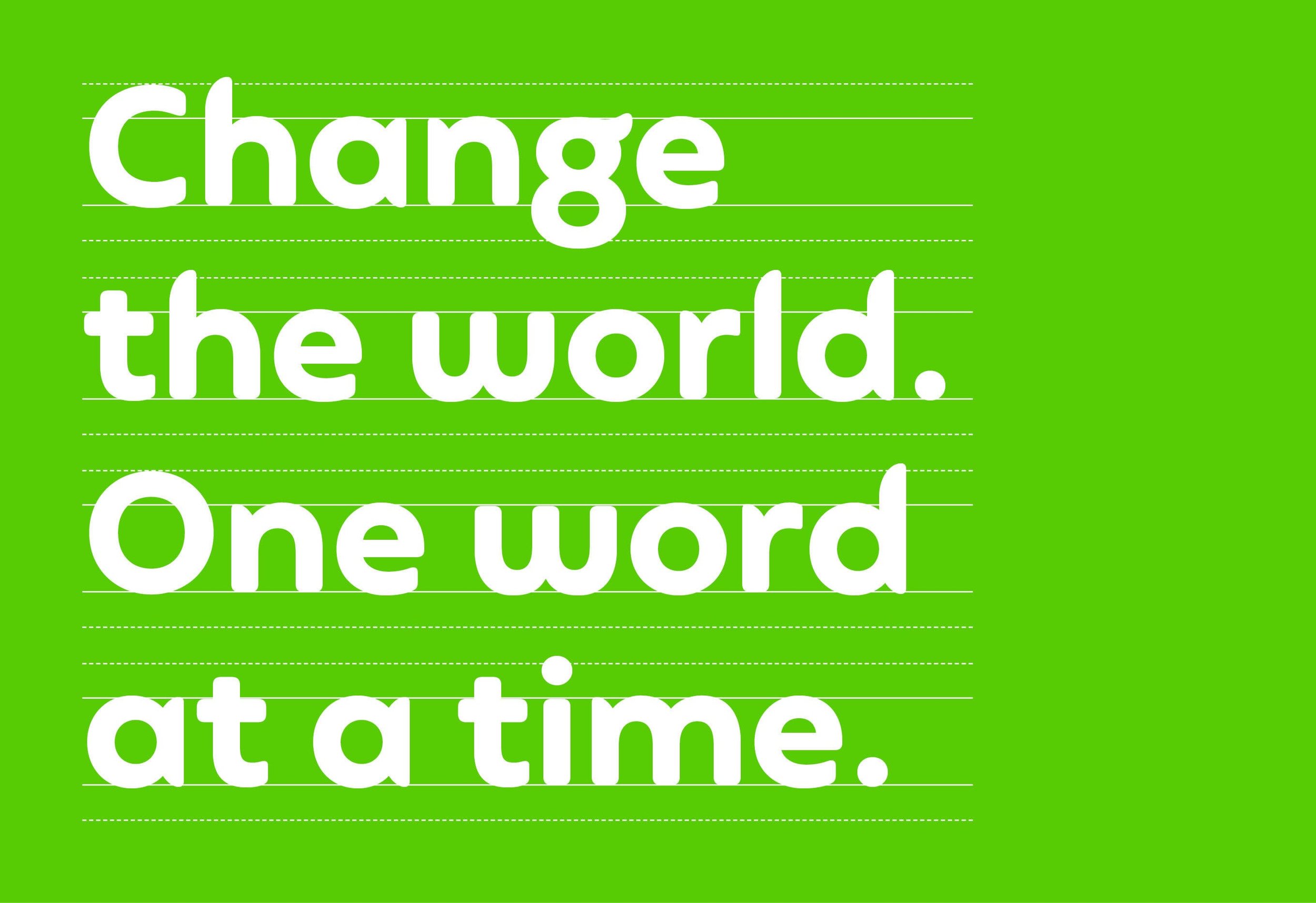
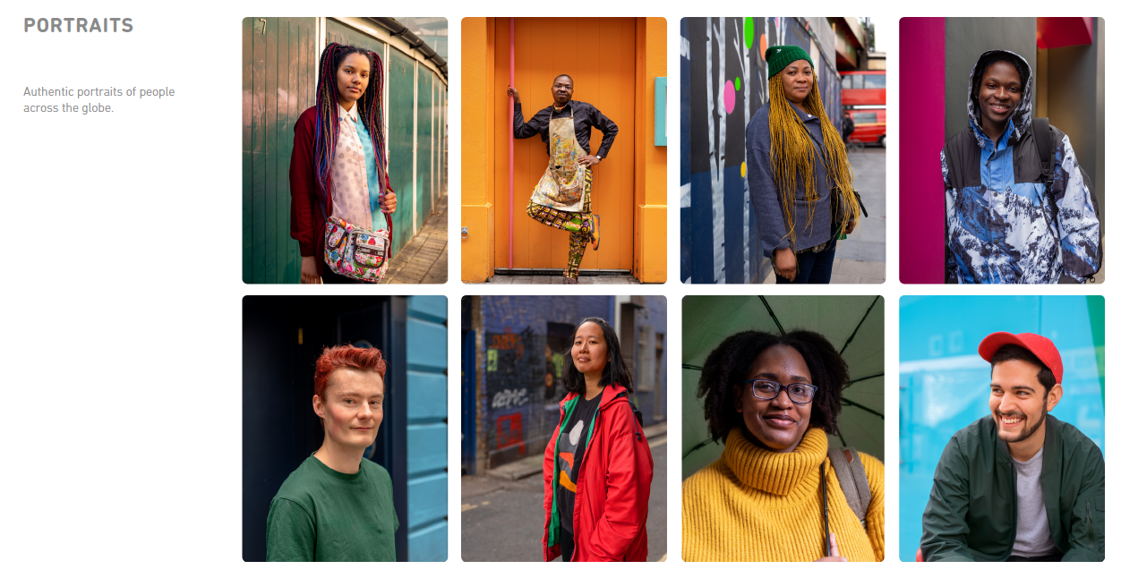
Duolingo is the world’s most popular way to learn a language. Since its inception in 2011, the app has been downloaded by more than 500 million people. By mid-2018, Duolingo’s leadership and staff began to feel that the brand’s positioning, messaging, and visual identity no longer supported the wide-ranging motivations of its global user base, nor its rapidly expanding product line. Moreover, they felt the brand did not adequately reflect the team’s belief that free language learning can genuinely transform lives. Studio Tomo Founder and Managing Director, James Wu, was hired by London-based design agency, Johnson Banks, to help address this challenge. Together, we landed on a core purpose echoing the brand’s commitment to universal access—”Everyone Can Duolingo”—laying the foundation for a clearer, more inclusive brand that better reflected the company’s mission, growth strategy, and influence on real peoples’ lives all around the world—without losing its trademark quirk.
Check out Johnson Banks’ full case study to learn more.


“Working with James? Unusual. A strategist with a keen eye for detail and as much passion for the quality of the final product as us? That's pretty rare.”
— Michael Johnson, Founder and Creative Director, Johnson Banks